
I am usually asked to work with a client because of one or more of these three reasons:
1. Poor accounting information.
2. Poor profitability.
3. Poor cash flow.
In terms of priorities, sometimes cash flow just can’t be ignored. If I have a choice, I begin with accounting information, meaning accurate and timely financial statements set up to provide meaningful information. This gives the client and me the information we need to deal with the other two issues.
Once we’ve got good information, sustainable profit is the goal and the more the better. Usually, not always, with good profit, good cash flow will follow. Cash flow problems are usually a symptom of poor profitability.
To have a business with sustainable profit, the business must fulfill a market need and have a good business model that provides healthy margins. Of course, they need to be able to bring in customers too.
Profit Levers
When the focus becomes the improvement of profits, I go looking for the profit levers in a business. By profit levers, I mean the cost-related issues that can be manipulated to increase net income. While business owners typically like to look to increase sales, I tend to look for cost efficiencies, particularly in people costs.
One of my tools in looking for profit levers is to understand the various cost behaviors. Some costs vary with sales volume, such as most cost of goods sold elements. Some costs are related to a period of time, the best example being rent. Other costs are a step-function, intermittent or irregular. And with some costs, it just isn’t clear how they behave. So I dig deeper in my toolbox.
Trending and Sparklines
Another tool I like to use is examining trends. To spot a trend, one needs at least three time periods. I prefer to look at the Income Statement (Profit & Loss) with monthly results on a 12-month trailing basis. That is, the 12 most recent months shown in columns. This is extremely helpful in spotting what is going on in the business. But 12 columns of Income Statements is a lot of numbers to look at and one can get lost in the sea of data.
That’s why I like sparklines. These are little graphs that can be put in one cell in Excel. For example, every line in your 12-month trailing Income Statements can have a little graph depicting the trends for that line. Here’s a simple little example using just six months and adding all three variations of sparklines that Excel offers.
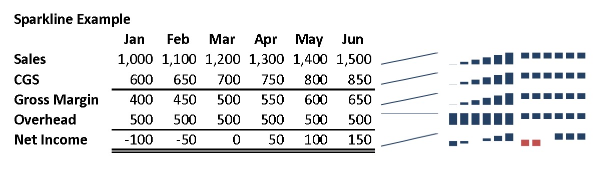
To put sparklines in your Excel worksheet you must have Excel 2010 or newer. Go to Insert on the toolbar. To the right of Charts you’ll see Sparklines. The three options are Line, Column and Win/Loss. All three are shown above. One can make a column of these little sparklines in about 30 seconds. At a glance, the trends for each line become clear.
No comments yet.